
The psychology of colour in brandin – and why most companies get it dangerously wrong.
Between 62% and 90% of a consumer’s first impression of a brand is determined by colour alone. Not by your messaging. Not by your product. Not by your carefully crafted tagline. By the time someone reads your first sentence, they’ve already decided how they feel about you and colour made that decision for them.
This isn’t a design preference. It’s neuroscience.
Yet most companies still choose brand colours based on what the founder likes, what competitors use, or what “looks premium.” The result is a visual identity that actively undermines the brand’s positioning – and the company never knows, because no one told them their colour palette was doing the talking before they opened their mouth.
Your Brain on Colour
Colour triggers neurotransmitters. That’s not marketing speak; it’s physiology. When you see a colour, your brain releases dopamine or serotonin depending on the hue, saturation, and context. This happens before conscious thought engages. Your emotional response to a brand’s colour palette is essentially involuntary.
This is why 85% of consumers cite colour as the primary reason for choosing one product over another. It’s why 81% of people remember a brand’s colour but only 43% remember its name. Colour isn’t a supporting element of brand identity. For most consumers, it is the brand identity; at least on first encounter.
Psychologists have understood this for decades. The branding industry, for the most part, has not caught up. Most brand guidelines treat colour as an aesthetic choice when it’s actually a strategic one — one with measurable consequences for how your audience perceives your authority, trustworthiness, and market position.
The Saturation Problem Most Brands Don’t Know They Have
Here’s where it gets interesting — and where the research challenges conventional wisdom.
A 2025 study published in the Journal of Consumer Research found that lower colour saturation increases a luxury brand’s perceived status. The mechanism is surprisingly intuitive: consumers unconsciously associate muted, desaturated tones with the passage of time. A colour that looks slightly faded signals heritage, continuity, and permanence. A colour that’s bright and vivid signals newness — which, in the luxury context, can actually work against you.
This creates a direct tension for brands moving upmarket. The instinct is to make everything bolder, richer, more visually intense — to “look expensive.” But the psychology runs in the opposite direction. The brands that are perceived as having the highest status are often the ones whose palettes whisper rather than shout.
Think of the difference between a saturated royal blue and a dusty, muted navy. Both are blue. Both can be “premium.” But one says “we’re trying to impress you” and the other says “we’ve been here long enough that we don’t need to.”
What Each Colour Actually Communicates, Beyond the Clichés
Every branding blog will tell you blue means trust and red means urgency. That’s not wrong, but it’s dangerously incomplete. The psychological effect of a colour depends on its saturation, its pairing, its cultural context, and – critically – the audience receiving it.
Black remains the most reliable signifier of authority and sophistication in Western markets. But it only works when used with restraint. A brand that uses black everywhere communicates severity, not luxury. The power of black lies in contrast — what it sits against, what it frames, what it excludes.
Deep greens and emeralds are emerging as the colour of choice for brands that want to signal both premium quality and ethical consciousness — a combination that’s increasingly demanded by high-net-worth consumers.
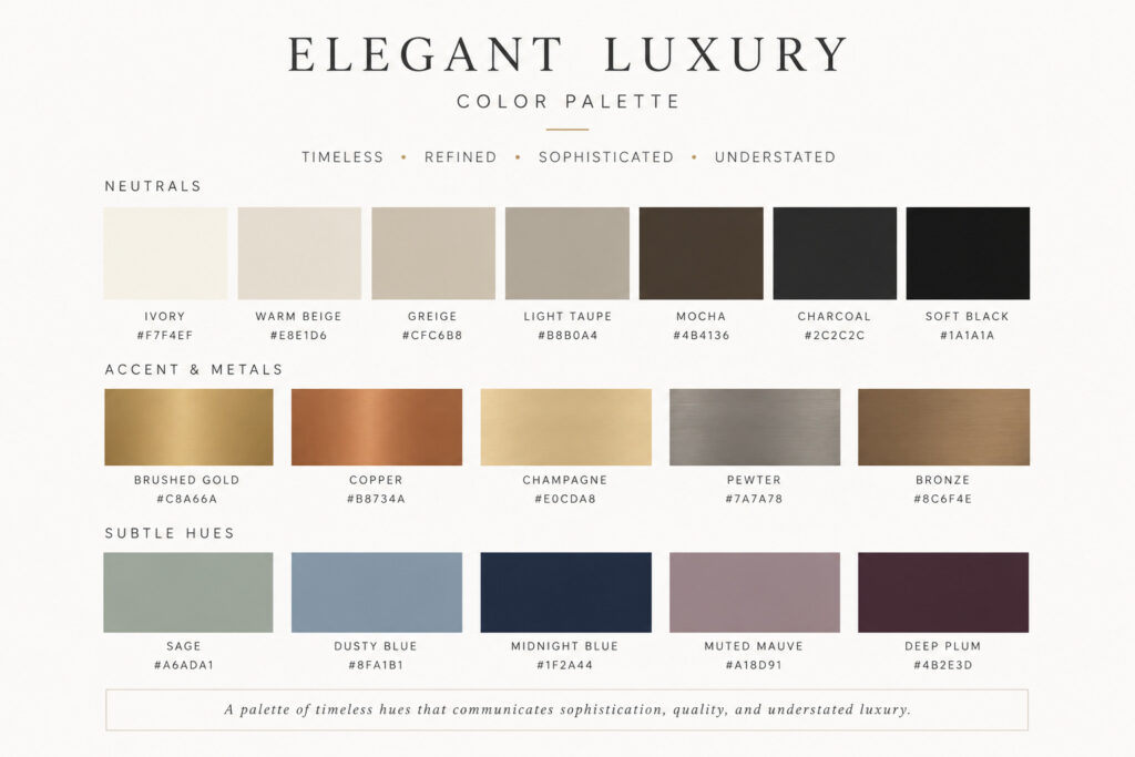
Warm neutrals – sand, taupe, stone, and the earthy tones that Pantone’s 2025 Colour of the Year (Mocha Mousse) represents signal groundedness and approachability without sacrificing sophistication. They’re the visual equivalent of a brand that’s confident enough to be quiet.
Brown and yellow, on the other hand, consistently test as signalling “cheap” across consumer perception studies, unless handled with exceptional care. If your brand is repositioning upmarket, these are the colours most likely to undercut your efforts without you realising it.
The point is not that certain colours are good and others are bad. It’s that every colour choice carries psychological weight, and most brands have never audited whether their palette is actually saying what they think it’s saying.
The Cultural Dimension Most Brands Ignore
Colour psychology is not universal. White symbolises purity and minimalism in Western markets. In several East Asian cultures, it’s the colour of mourning. Red signals luck and prosperity in China; in Western corporate contexts, it signals urgency or danger.
For brands operating across markets or targeting internationally mobile HNW clients, this isn’t a footnote. It’s a strategic vulnerability. A colour palette that works beautifully in London may actively repel clients in Dubai, Shanghai, or São Paulo. And unlike verbal messaging, which most companies localise carefully, colour palettes are almost never adapted, even when they should be.
The Consistency Multiplier
Research consistently shows that consistent use of signature colours increases brand recognition by up to 80%. But consistency doesn’t just mean using the same hex codes on your website and business cards. It means ensuring that the psychological message of your colour palette is reinforced at every touchpoint; from the tint of your email headers to the warmth of your office lighting to the background of your LinkedIn posts.
Inconsistency in colour application creates cognitive dissonance. The viewer doesn’t consciously notice it, but something feels off. And “something feels off” is the exact opposite of what you want a potential client to experience when they encounter your brand for the first time.
What to Do with This
If you’re repositioning your brand, particularly toward a higher-value audience, your colour palette deserves the same strategic rigour as your pricing model, your messaging framework, or your client experience design.
That means starting with psychology, not Pinterest boards. It means understanding what your current colours are actually communicating (not what you intend them to), testing how those colours are received by your target audience across cultures, and building a palette that reinforces your positioning at a neurological level, before the conscious mind has even engaged.
Because by the time your audience reads your first word, the colour has already spoken.JT Maison builds brand identities grounded in strategy, psychology, and the kind of precision that high-value audiences notice. If your brand’s visual identity needs more than a refresh — it needs a rethink